Thursday 22 March 2012

Looking back at Phone Apps

After the crit it was apparent that although our idea for the phone app was good, the overall design and appearance of it was not well exicuted. It was also suggested that we show more pages on our boards. For this I need to have a look at other designs of phone apps and how we can improve and make our proposal more believable.

 
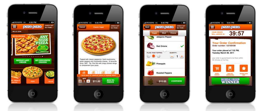
This collection of phone apps look as a whole; sleek but unified. This is something that I didn't manage to achieve when creating the app, I feel that it looked fairly childish and this is what we need to veer away from. 

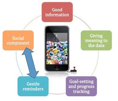
I thought that this page worked well as placing the app in context; something to think about for the presentation boards...to show where and why the app would be useful even if it was a simple vector drawing. 

The subjects of the apps here are not hugely relevant however I was just looking at the basic layout of phone apps, the size and colour of the tabs and so on. 

Using the strip of icons allong the bottom is a good way of uniting all the pages and makes the app look more proffessional. 


I feel that having a simple but unanimous colour scheme throughout each of the different pages of app is essential for it to look professional and plausible. 

Overall, this is the basic appearance that I feel we need to start designing towards; using a background texture / gradient is a starting point. I used this app design as a reference because of the typeface used which is similar to what we are using at the moment. I also feel that for the icons / buttons, we need to make more illustrative and interesting because at the moment they are just simple blocks of text which you have to 'tap'/ 


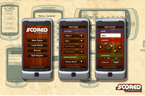
For the presentation boards I think that this is a much better and more interesting layout for the phones rather than just presenting them in a line. 


Wednesday 14 March 2012

Fruit Characters - examples and variations

I have created a series of fruit characters for the flavours of the drinks however I don't feel that they are 'happy' enough or show enough emotion so I wanted to reflect and look at how other people have designed them and what the difference is between theirs and mine


Promotional Poster - How do they get our attention

Producing a series of promotional posters is part of how we want to raise awareness of Feel Good Drinks and make the brand famous. For this I need to look at current promotional posters and how they catch the target audience's attention through type, image and a combination of the two.
As a general feel, a poster that is less crowded and has more negative space appears sophisticated and easier to read as the majority of people will only hold their eyes on a poster for 1-3 seconds so the message needs to be clear and brief. 


Open publication - Free publishing - More advertising


The majority of the posters have a simple plain colour in the background then a single image with a clear represenation e.g. the fruit in a glass, or the fruit dressed up - a light hearted tone but the message is clear. This is the direction that I think we should go


Napkins

One of our ideas to help make the Feel Good drinks famous and to promote their drinks is to design simple napkins to place in cafe's, independant sandwich shops etc;
The website below is just to look at different sizes, examples, templates and designs.

http://www.viecoballoons.com/napkin.htm


Below are a few images that I have found exploring current napkins, what is written and designed on them and how they engage with the customers.


Phone Apps

One of our main ideas to "raise awareness" of feel good drinks was to propose the design for a smart phone app where you could turn on the notifications and reminders would pop up when you are near to a store that sells Feel Good Drinks. One of the problems that we identified about the product that wasn't stated in the brief was that these drinks are incredibly difficult to locate, so for people to know about them they have to see them....hence the pop up notifications. From here, the person could click 'show me' and it would then direct you using a live map of the person and the destination. 

Below are a few images of healthy eating or food advice apps that have already been created. 


Monday 5 March 2012

Current Feel Good Drink Posters

I have found some current posters, some look like they were the official ones that have been used to promote their drinks while others look like they were created for design purposes and were never used publicly.
Most of the posters are pretty simple, using white space to attract the eye of the audience, while other posters have used the opposite method and used an abundance of colour and bold / basic shapes


These two adverts are examples of what I was talking about above, using lots of bold bright colours that will contrasts to the surrounding environment to catch the eye of the audience. Although I think that they are successful in doing this, I feel there needs to be more facts about the product on the advert rather than just showing images of the inside of people and representing their healthiness and goodness that way, a simple line saying '100% natural ingredients' or 'absolutely no sugar' would keep the attention of people, otherwise people may just walk by thinking that it is just another sugar filled fruit juice. 


Simple, silly but amusing and rememberable


I really like this piece of design. I don't think that it was use officially as an advert for the product however I do like the simple choice of colours and the use of white space to try and attract the target audience's eye. The poster has a sophisticated yet friendly appearance - However I don't feel that the typefaces that has been chosen for the main heading works, I think that it needs to be more in-keeping with the main typefaces used for the brand. 

Simple but easily identifiable with the brand. The one issue with this poster is there is no image of the product on so people would not necessarily automatically make the connection if they saw the product on the shelf in a supermarket. 

Im not really a fan of this poster, it is too complicated and distracts from the product as well as the fact that you can hardly make out what the text says. I know the the lines are meant to represent the measurments of emotions and experiences when you drink this, but I don't believe this has come across very effectively and instead just blocks out the image of the drink. 


I think these are the official adverts. By placing an images of a cartoon character at the bottom it does give the drinks more character, however I don't really see the relevance and can be slightly distracting from the rest of the poster; I feel that placing information here would be more effective. I do like the colours that have been used in the blue poster, they compliment the colour of the drink well. 


Ideas for Bottle Labels

One of the main part of the we will be doing is re-designing the bottle label as I feel that the bottle will need to stand out for people to be able to chose the product.
At the moment the label is the same as pretty much all of its competitors, and for it to stand out I think it needs to be different...opposite.