
Is a book that which explores the relationship between packaging design and brand identity. I took out the library which contains the most amazing and innovative selection of packaging examples. Each one of them are different and represent a different way of designing packaging.
I have only taken pictures of the examples which I feel will be most beneficial in understanding different ways of designing packaging, however the book is like a manual with step to remember when create packaging - so it is something I am going to keep hold on of use throughout my designing.
The images below are more about the design of packaging, the language, and the branding - as I need to develop my brand for my Good further.

- Innovative and smart way of packaging a product which could then be re-used to keep it on display.

- Cutting out the type of the brandname

- Packaging which is functional and relevant to the what is inside it - could research how I could involve this.

- Personal message - makes the product more appealing, friendly and inviting.

- The function of the product is written on the exterior of the product

- Simplistic but smart

- Use of branding, language and colour - visual approach is dominated by humerous text in large - scale typeography and use of white space to highlight the message

- Simplistic and obvious naming of product, clear graphics, the strapline statement speaks clearly to the customer making the product more personal
- Twist of humour in the logo where the 'o o' is converted into a cherry.

- Packaging created for over the counter health care.
- Friendly, straightforward, colour coded packaging system that ensures that each product line reflects the company's mission to make health issues simple.

- Use of logos in is communication
- High degree of clarity with the label that states exactly what the product is for
- A text hierarchy displaying the different levels of information and no other visual components

- Created for a line of skin care masks
- Design features the use of experimental humour to good effect
- The packaging has a black and white image of a woman with the product flavour / ingredients on her nose - appearing like a clown nose
- The final packaging is irrelevant but is fun and distinctive.

- Looking at developing unique shapes for both the product and the packaging
- Some brands are well known and recognisable simply because of the shape of the product - no labels are actually needed - innovative and inspirational.
- It can help distinguish a product from its competitors.

- Surface graphics - adds a playful structure to the packaging design
- power of the brand is built up through repetition
- "Elegance is the simplicity found at the far side of complexity. An elegant solution is one in which the optimal outcome is achieved with the minimal expenditure of effort and expense.

- Choosing materials - this needs to be one of your first considerations - and their ability to successfully contain the product.
- This page above illustrates unique packaging that was created for a delux foil-blocked limited edition
- Contains a hand printed box containing pieces of mounted granite bar and floor from the original club.
- It is a stunning piece of original artwork as packaging design

- Think of the front and back (inside and outside) of the packaging
- Creative label concept - design solutino features a single colour screeen printed label with reserved-out lettering printed in reverse to appear backwards on the front label. This lettering appears correctly when viewed from the back of the bottle whereby it is magnified by the glass
- It is a striking label and not one you would easily forget.
- The label is using the an element of the function of the product / bottle to create its effect.

- Product is part of the packaging
- package produced through an environmentally friendly process and made from all natural materials.
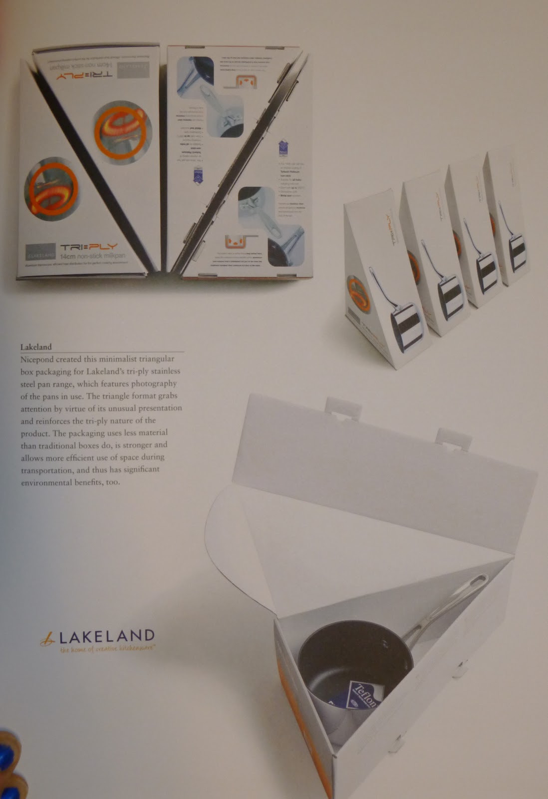
- Minimalist, triangular formation for the packaging which fits the shape of the product exactly
- The triangular format grabs the attention by virtue of its unusual presentation and reinforces the tri-ply nature of the product.
- The packaging using less material than traditional packaging boxes - stronger and more economical.
No comments:
Post a Comment