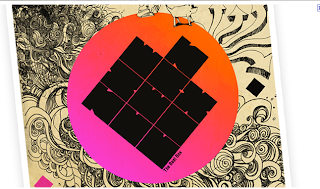
The improvements which I need to reserach and use for my logo development is to
- develop the key image further
- explore the typeface of writing
- what is written - words
- look at overall compostition.
SO...
now I am just going to jot down some of the examples of logos and images which I can mine in the direction of.
WEBSITE - shows different images of sound waves
WEBSITE - useful on how to create logo designs/brainstorming/tutorials
WEBSITE - interesting logo designs and use of colour/gradients
WEBSITE - possible typeface for logo
 |
| Instead of the sound waves I could use this symbol/simplify it a little bit |
 |
| Simplistic view of sound waves |
 |
| Soundwaves showed in colours shapes overlayed, also looking at the way the logo has been layed out |
Simple sound waves
More innovative soundwaves, they are made in a box - ?
Layout of logo
Layout of logo - have the logo on left and text aligned on the right
Another way of showing soundwaves; I don't think that this will really work for my logo but its good to keep as a visual reference
I love this image, detailed, delicate and stylistic, I want to take this as inspiration however I feel that this will be far too complicated for my logo development
This is what I originally based my logo on
Logo which is similar but presented differently
Typeface - simple and good for music logo
Typeface - similar to what I had in mind
Typography reference -
Simplistic, modernistic
I like this typeography - the link for the website is above
The website link for this logo and others similar is above, I like the use of gradient and block letterforms however they arent legible,
Good typeface example


No comments:
Post a Comment