

Monday 31 October 2011
Music Promotional Posters
Tuesday 25 October 2011
TASK 4 - SPECIALIST PRODUCTION & DEFINITIONS
From looking at the task - it appears that it is asking us to branch out in terms of media. The previous tasks have been mainly focusing on paper based print materials (with the exception of Pad printing). For this I want to see what range there is of strange but innovative ways designers have created that is different and interacts with the target audience. Some areas I have come up with to look at are;


 Printing on an exiting floor surface, stands out and unmissable. Taking this idea of printing on exiting surfaces, you could use transfers or digital print stickers (like the designs on transit vans) and explore what else you could apply this to; buildings, windows, walls - the concept of of incorporating the surrounding environment into part of the design


- plastic
- metal
- clothing
- malleable / expandable materials. Do you have to perform an action to be able to see what the design is saying?
- 3D
- buildings
- objects
- reflective surfaces
- transparent / translucent - do they incorporate what can be seen behind the design into the piece?
- holographic.
- functional design e.g. packaging - does it perform a function?
- Does the packaging have to have another concept behind it other than packaging the product for it to work and catch peoples eye?
- Touch sensative packaging - not just to look at but what does it feel like?
- Does the print material become part of the design?
- what do you have to do to see the actual design - puzzle pieces, fold, unfold, build, cut?
- Does the print need to have a combination of materials?
In reference to the pantone matching system - also I want to look at the colours that have been used in these processes - are they the main focus of the design, how do they influence the design - how would the design appear if the colours were different, and if the design was placed out of context, would it still work?
PANTON MATCHING SYSTEM (PMS)
BRANDING & IDENTITY
I have been looking at many different ways of printing a business card, many of which are printed on materials or perform a function that related to the profession or what the information is communicating. It is clear that some of the more successful pieces of design perform a function rather than just being a piece of design with information on it.

Fold up / fold out to get the audience to ineract and navigate their way around the deisng
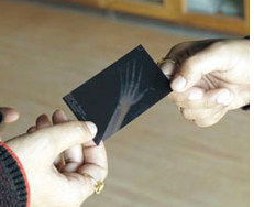
Printing on stransparent material giving the X-ray effect, simple and relevant.
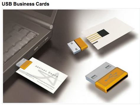
I think that this business card is particularly successful - it is printed on the product that the profession / company is based on - technically the business card is part of the product.


Innovative design - using more than one materials to illustrate and communicate what the design is about - garden design.

Simple cards that are instantly recognisable what profession they are communicating. A highly useful design - aimed at an audience with long hair - hair clips are something that one can never have enough of and are constantly disappearing so the business card doubles up as a free purchase!

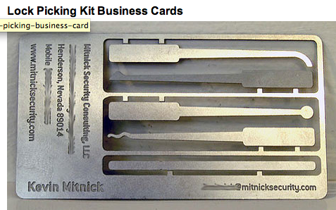
Printed on metal - appropriate material - stands out. Although this is not a appropriate example of design for print because the text has been engraved into the metal, I wanted to use this as an another example of using materials that perform a function / relevant to the information.

Interactive design - slightly problematic as once you have eaten the design you don't have the business card at hand anymore, naturally it is intended that you store the information before you eat it, however it is always useful to have the design always visually present as a visual reminder.

This is one of my favourite pieces of design on a different material. It is a business card for a personal trainer. The design and information on it is simple, but it is the clever use of gym materials that get you to interact with the card that will make sure that it stays in your mind.

Another example of printing on a different material - a plastic building block. Simple, innovative and easily identifiable. A good representation of the business.

Printing on wood - on this object it would be slightly harder to print on rather than just pringing on a sheet of wood because of the print process. You could use the letter press process for this, also you would have to consider the ink being absorbed into the wood, in which case you would need to varnish the wood before hand.

Translucent materials / plastics where what is seen behind the design is incorporated into the whole design. The concept behind the company / brand is the that they will 'change the way you look at search', and they are designing this practically through translucent material - changing your vision.
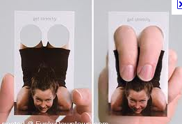
Interactive and amusing a piece of design. The design is not complete on its own, it needs the target audience's interaction for it to be complete, very innotavite.


This is another business card that also uses what you can see through the material behind when the design is held up. The design is not complete without the surrounding area / other element of the concept of design. This piece is interactive and very amusing, fun to play with and easy to remember. A simple design - something that people will remember.


This is one of my favourite pieces that I found. It is a very innovative way of branding / identity. The information comes in a form of a stamp and it can print onto vertually any surface, so the design is only complete when the person gives out their details - in which case every finished piece will be different.

Simple stock, but the ink is invisible until it is burned and will show through the stock - interactive and intriguing. Every business card will appear different as it requires the input of a naked light.

Edible business cards - embossed information printed onto the surface of the biscuit. This is another of my favourites, although it is not using design for print, it is involving a print process.


Humorous, ineractive, individual and innovative. Another good example of how the print design has to involve the use of another material and the interaction of someone for it to be complete.
PACKAGING & PROMOTION
Here I was looking at clever packaging that doubles up to perform a function.

Mini butter where the lid acts as a knife to spread it.

Range of waters that double up as fitness tools / weights.

Spreads where the lids become the knives.

Functional packaging - this is something that I want to maybe look into incorporating in my work.


A spin off the 'mr muscle' cleening products and playing on the idea that cleaning is a work out - functional packaging, the label is not printed directly onto the surface of the packaging but it is part of the whole concept.

Printing directly onto transparent plastic, allowing the product (liquid) to give the product its colour and interesting appearance. Simple print design but the different colours of the liquid give an interesting end result. Strange shaped packaging - pear shaped, making this product stand out in relation to the other products if it was in a store.

Interactive packaging which gives way to the print below.

very clever design of a pill packet - interactive and the design develops over time, printing on foil giving the added appearance of bullet holes.


PUBLISHING & EDITORIAL
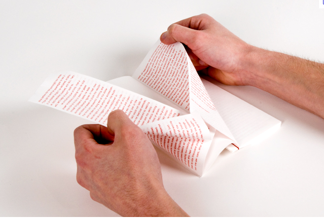
I thought that this project which I found on behance is a very interesting way of presenting the print. Although the publication is printed on the normal stock, the way that it has been re-designed is what I have found interesting. One could use this concept of manipulating a publication and then explore other stocks / substrates that could do the same thing.


INFORMATION & WAYFINDING


Having part of the design cut out and using a different material - a mix of materials.

Transparent packaging - innovative and the design of the packaging would depend on the appearance of the product, you would have to design around this.

Interactive information printed on paper based stock.

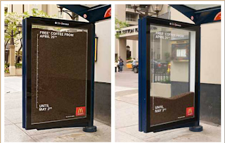
A clever bus shelter design and a humorous solution, the design needs the final element (a person) to be completed. .

Incorporating the surroundings - engages people.


Printing on bubble wrap - the print design is simple but the deisgn is more about the action of popping the bubbles. Functional design. The material it is printed is well known for being 'addictive' to interact with, so it is a clever idea - taking something that people find difficult to rests touching / popping, and advertising the product with it.
Subscribe to:
Posts (Atom)