

This is a beautiful piece of design advertising an art director club. It caught my eye because of the colour and the delicate and light design of it. It would be seen in a magazine/book and aimed at designers and the art world. I love the colour scheme and the geometric shapes.

This is an advertisement for DOCKERS clothing, and more specifically for trousers. The combination of type and image makes the trousers stand out - it is a very innovative idea. This advert would be seen on streets, billboards, magazines, shop windows and is aimed at men. It is a clever advert, saying 'if your a man then you should be wearing these trousers because of all the things they represent.' It is a good and successful piece of graphic design, I love the use of type and image together.
WTF COLLECTION


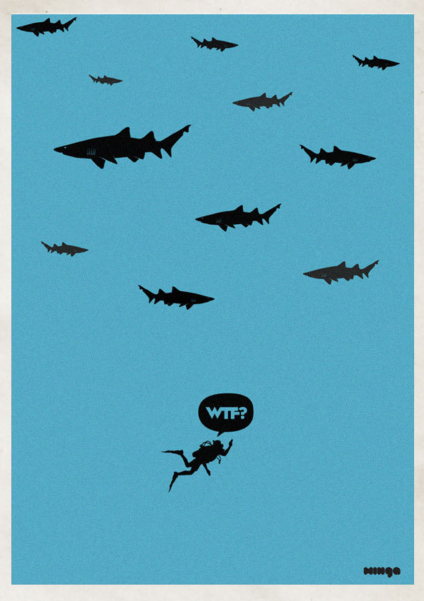

This is a humorous collection of graphic design. It would be seen in an exhibition, and maybe reproduced to go on gift cards, posters etc. I like the simple colour scheme and the simple humorous message. It would be aimed at people who have interest in illustration and small, simple humour. Very successful collection of work, I find them very amusing and ingenious.


This project took my interested because of the way it its format and the content. This is the type of work I love doing. It is aimed at his potential clients - it is a small showcase of his work which he mailed out. It is a very clever way of publicising his work. It is very successful as it is interesting and eye-catching because of the black and white colours with alternate bright colours which makes it stand out.


This I chose because of its innovative idea of representing the weather and temperatures through colour and making it in to an A6 fold up booklet. It is simple, clear and clever so a very successful piece. In a sense it is an information booklet and appreciated from a designers point of view.
BRANDING


Branding is something I have always been interested in but this collection designed for a hotel so it would be shown on every product as their logo, every booklet, the internet, magazines for advertising, menus etc. It is a sophisticated yet modern design. The loose/swirls of the logo contrast well with the other typeface.


This piece of work is to be used in a house, it is a personal piece and something to stick up on your bedroom wall or somewhere in your house. It engages the viewer and every final result of the piece will be different, it is unique and personal. It is aimed at the general public - from all ages, it could be used by a mother on her children or by someone who just wants to record their moods visually and quickly. It is a very successful and creative piece of design.

This is one of a series of drink aware advertisements which ABSOLUTE VOKDA HAVE produced. It uses the shock factor and the play on words to make people look and think about the results of drinking and driving. It is also a play on images where the body bag is shaped in the distinctive form of the absolute vodka bottle. It is aimed at population who can drive, to make them aware of not drinking and driving.
Amy Rodchester Portfolio - D&AD

This is a series of posters advertising the Festival of Dance in Newcastle - it targets a series of different audiences by showing the different styles of dance from ballet to rock and roll. These posters would be put up in shops, university buildings, and on the streets. The abstract arrangement and treatment of photographs is what caught my eye and although I couldn't tell what the posters were trying advertise from a distance it is obviously appealing to those who take an interested in dance.
INNOVATIVE BUSINESS CARDS


This is a very clever set of design, each of them are business cards but they have thought out of the box when designing them and each of them interact with the viewer. Because of the cards getting the viewer to interact or 'play' with them, the company/person is more likely to be remembered. They would be handed out to potential clients so aimed at the general public interested in each of the areas e.g. someone who was joining a gym and wanted a personal trainer (top business card)
No comments:
Post a Comment