
the type has to be based on the word 'opposite' - I will research this after looking at these posters below - one thought about this part of the brief is that i can look into/compare the 'opposites' of simple and complex/detailed typography on posters

complex - some of the typography is visible and other parts dissolve into design/pattern giving smoke effect

A simple poster on white stock and a couple words highlighted.

Poster stands out because of the bold blocks of colour contrasted with white background behind text - not a very intersting poster but effective and makes you concentrate on what is being written rather than being complicated by other designs

I love this piece - the faded text in background and the coffee strained effect giving the poster a rustic feel - overlaying and unusual cropping of text adds to the interest for me

Simple and repetitive design - creates and interesting pattern especially with the variations of colour in the background however the actual text doesn't stand out (what is being written) and is more a piece of design than an informative, productive poster.

Love this poster - simple and effective and and interesting layout/design/extension of the text - the elongated parts of the letters.

Another very simple poster which I feel is effective and an intersting example of layout

I love the colours and designs behind the typography in this - creates a very dynamic piece and very interesting/colourful - the use of the bold typography allows more of the design behind to be visible and looks more like a piece of design than a piece of typography

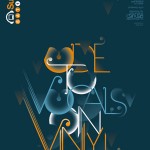
Simple and interesting development of the text into an image

Love this design - dynamic but kept simple through using tones of black and white - this is quite similar to the poster above which I loved.

Intersting layout - not hugely clear poster and it is more about text as image - the typography fills most of the page but still for me I do not concentrate on what is being written and instead on the colours and textures used.

intersting simple design

Love the simplicity of this and the typeface - centrally alighen

Here i am thinking more about having the type covering the entire page but focusing on the design WITHIN the text

looking at printing on different medias

Love the negeative/cut out effect of the typography on the stencil of the image


Below is a link to a series of images i found where parts of the type have been cut out diving it a intersting result

Love the use of different transparency of filters/squares over the type and image
No comments:
Post a Comment