Below are a series of images I have reserached - looking at the effects of typography when it is layered and how it is layered - then looking at non-layered typography.
One thing i have noticed is that typography pieces which are NOT layered tend to look smarter and are more legible and pieces which are layered are less legible and focus less on what is being written in the text and more of the layout/effect it the layering creates.


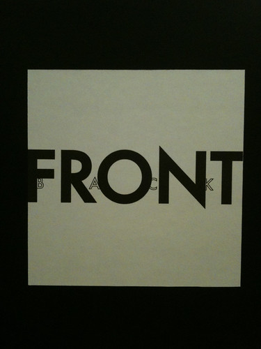
Clever layring of both type and colour

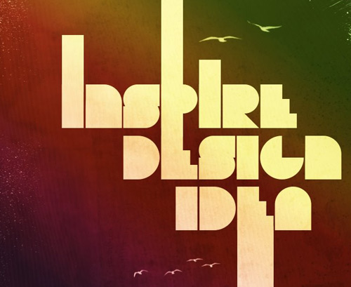
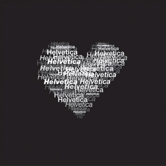
Simple layering


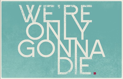
Using the same typeface - this isnt extreme layering like in the other posters - instead the gaps between the lines of text have been removed so that the text's legiblity is reduced and it appears to be more of a pattern.


Experimenting with layering of colours

The layering effect on PHOTOSHOP - increases the luminosity effect of the text - more saturated effect of colour makes it appear brighter


Mass layering creates a cluttered/tacky impression to the poster. It is an interesting piece none the less however i find it too confusing

layering of text on coloured background


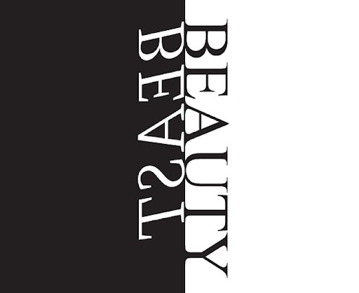
NON-LAYERED TEXT
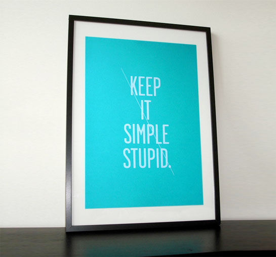
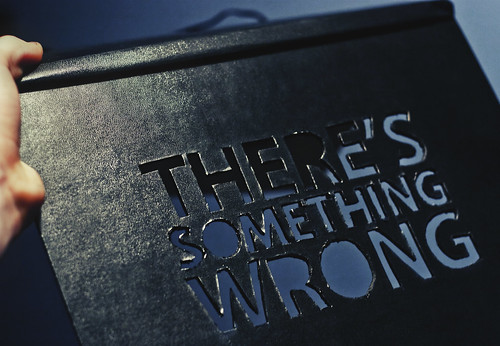
Simple and smart

keeps more of a focus

interesting layout of page,


collection of posters where layering of text isnt used however the text in some cases is placed over blocks of colour/shapes

text and image