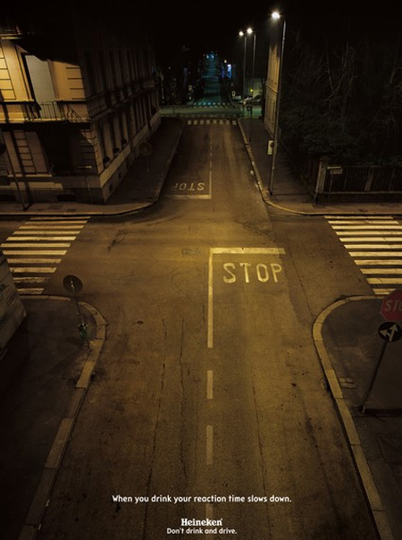
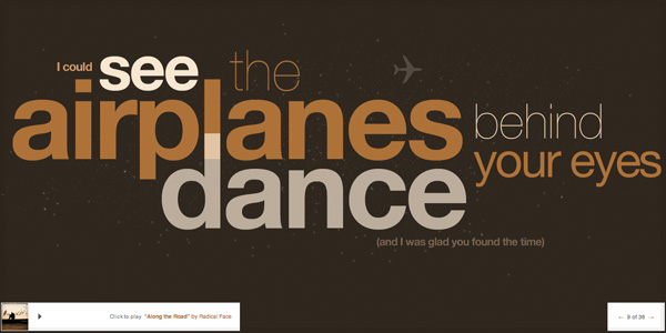
Below are some examples of posters which I am using for inspiration of the layout, type, form and how effectively it communicated the message to the audience. Some of the images are related to underage drinking and some I have displayed because I feel they are effective in providing a clear message.
IMAGE POSTERS
TEXT POSTERS
EXAMPLES OF POSTER LAYOUT
TEXT - elements to consider
- overlaying,
- distorted,
- use of overlapping,
- different sizes,
- contrast - using same typeface but use normal, bold and italic
- spacing,
- arrangement on page,
- boarders,
- orientation,
- transparency,
- bold, italic,
- font,
- how much of the page will be used by text,
- how much free space,
- underlining,
- colours (only 2),
- certain letters, words in a brighter colour to stand out,
- shadows,
- illuminated text
- repetition
- reflection














No comments:
Post a Comment